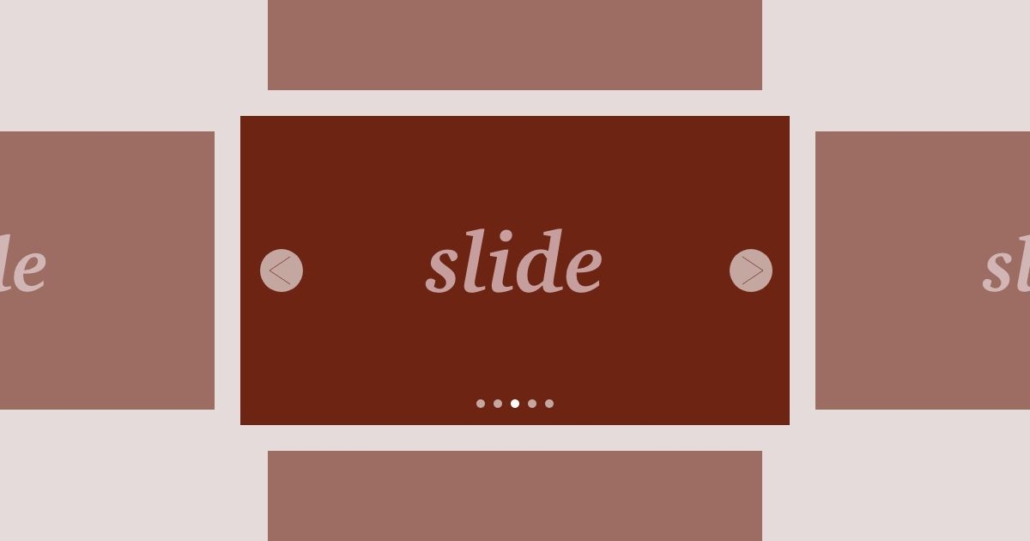
サムネイルを円形のプログレスバーに見立てたSwiperスライダーを実装してみる(備忘録)
今回は結構難しかった。記事にするか悩んだがなんとか実装できたので書いていきたい。
よく最近のWEBデザインのページを見ていると、スライダー部分に対して、プログレスバーに連動してスライドが切り替わるものが多く、これをswiperでできないかと考えた。
今回は下記の記事を応用して作成している。
円形のプログレスバーを作る知識も必要になるので、CSSの知識がある程度ないと厳しい内容かと思うが、こちらも合わせて解説していければと思う。
HTMLの記述について
<!DOCTYPE html>
<html lang="ja">
<head>
  <meta charset="UTF-8">
  <meta name="viewport" content="width=device-width, initial-scale=1.0">
  <title>Swiperスライダー|freefuntimes – 自由で楽しいひとときを…</title>
  <link rel="stylesheet" href="../reset.css">
  <link rel="stylesheet" href="https://unpkg.com/swiper@8/swiper-bundle.min.css" />
  <link rel="stylesheet" href="style.css">
</head>
<body>
  <main>
    <div class="swiper mySwiper2">
      <div class="swiper-wrapper">
        <div class="swiper-slide">
          <img src="img1.jpg" />
        </div>
        <div class="swiper-slide">
          <img src="img2.jpg" />
        </div>
        <div class="swiper-slide">
          <img src="img3.jpg" />
        </div>
        <div class="swiper-slide">
          <img src="img4.jpg" />
        </div>
      </div>
      <div class="swiper-button-next"></div>
      <div class="swiper-button-prev"></div>
    </div>
    <div class="swiper mySwiper">
      <div class="swiper-wrapper">
        <div class="swiper-slide">
          <div class="circle">
            <div class="circle_inner">1</div>
          </div>
        </div>
        <div class="swiper-slide">
          <div class="circle">
            <div class="circle_inner">2</div>
          </div>
        </div>
        <div class="swiper-slide">
          <div class="circle">
            <div class="circle_inner">3</div>
          </div>
        </div>
        <div class="swiper-slide">
          <div class="circle">
            <div class="circle_inner">4</div>
          </div>
        </div>
      </div>
    </div>
    <section>
      <div class="ly_inner" id="menu1">
        <h2>menu1</h2>
        <div class="md_textblock">
          <p>テキストが入りますテキストが入りますテキストが入りますテキストが入りますテキストが入りますテキストが入ります</p>
          <p>テキストが入りますテキストが入りますテキストが入りますテキストが入りますテキストが入りますテキストが入ります</p>
          <p>テキストが入りますテキストが入りますテキストが入りますテキストが入りますテキストが入りますテキストが入ります</p>
          <p>テキストが入りますテキストが入りますテキストが入りますテキストが入りますテキストが入りますテキストが入ります</p>
          <p>テキストが入りますテキストが入りますテキストが入りますテキストが入りますテキストが入りますテキストが入ります</p>
        </div>
      </div>
    </section>
    <section>
      <div class="ly_inner" id="menu2">
        <h2>menu2</h2>
        <div class="md_textblock">
          <p>テキストが入りますテキストが入りますテキストが入りますテキストが入りますテキストが入りますテキストが入ります</p>
          <p>テキストが入りますテキストが入りますテキストが入りますテキストが入りますテキストが入りますテキストが入ります</p>
          <p>テキストが入りますテキストが入りますテキストが入りますテキストが入りますテキストが入りますテキストが入ります</p>
          <p>テキストが入りますテキストが入りますテキストが入りますテキストが入りますテキストが入りますテキストが入ります</p>
          <p>テキストが入りますテキストが入りますテキストが入りますテキストが入りますテキストが入りますテキストが入ります</p>
        </div>
      </div>
    </section>
    <section>
      <div class="ly_inner" id="menu3">
        <h2>menu3</h2>
        <div class="md_textblock">
          <p>テキストが入りますテキストが入りますテキストが入りますテキストが入りますテキストが入りますテキストが入ります</p>
          <p>テキストが入りますテキストが入りますテキストが入りますテキストが入りますテキストが入りますテキストが入ります</p>
          <p>テキストが入りますテキストが入りますテキストが入りますテキストが入りますテキストが入りますテキストが入ります</p>
          <p>テキストが入りますテキストが入りますテキストが入りますテキストが入りますテキストが入りますテキストが入ります</p>
          <p>テキストが入りますテキストが入りますテキストが入りますテキストが入りますテキストが入りますテキストが入ります</p>
        </div>
      </div>
    </section>
    <section>
      <div class="ly_inner" id="menu4">
        <h2>menu4</h2>
        <div class="md_textblock">
          <p>テキストが入りますテキストが入りますテキストが入りますテキストが入りますテキストが入りますテキストが入ります</p>
          <p>テキストが入りますテキストが入りますテキストが入りますテキストが入りますテキストが入りますテキストが入ります</p>
          <p>テキストが入りますテキストが入りますテキストが入りますテキストが入りますテキストが入りますテキストが入ります</p>
          <p>テキストが入りますテキストが入りますテキストが入りますテキストが入りますテキストが入りますテキストが入ります</p>
          <p>テキストが入りますテキストが入りますテキストが入りますテキストが入りますテキストが入りますテキストが入ります</p>
        </div>
      </div>
    </section>
    <section>
      <div class="ly_inner" id="menu5">
        <h2>menu5</h2>
        <div class="md_textblock">
          <p>テキストが入りますテキストが入りますテキストが入りますテキストが入りますテキストが入りますテキストが入ります</p>
          <p>テキストが入りますテキストが入りますテキストが入りますテキストが入りますテキストが入りますテキストが入ります</p>
          <p>テキストが入りますテキストが入りますテキストが入りますテキストが入りますテキストが入りますテキストが入ります</p>
          <p>テキストが入りますテキストが入りますテキストが入りますテキストが入りますテキストが入りますテキストが入ります</p>
          <p>テキストが入りますテキストが入りますテキストが入りますテキストが入りますテキストが入りますテキストが入ります</p>
        </div>
      </div>
    </section>
  </main>
  <script src="https://unpkg.com/swiper@8/swiper-bundle.min.js"></script>
  <script src="style.js"></script>
</body>
</html>
画像のスライダー部分を作成
<div class="swiper mySwiper2">
  <div class="swiper-wrapper">
    <div class="swiper-slide">
      <img src="img1.jpg" />
    </div>
    <div class="swiper-slide">
      <img src="img2.jpg" />
    </div>
    <div class="swiper-slide">
      <img src="img3.jpg" />
    </div>
    <div class="swiper-slide">
      <img src="img4.jpg" />
    </div>
  </div>
  <div class="swiper-button-next"></div>
  <div class="swiper-button-prev"></div>
</div>
上記ソースでは、mySwiper2(任意の名前でOK)のclass名をつけて画像部分のスライダーを作成している。また、ナビゲーション(左右の丸い矢印部分)も合わせて対応している。これらの点は前回書いた記事の内容と同じである。
円形のプログレスバー部分を作成
<div class="swiper mySwiper">
  <div class="swiper-wrapper">
    <div class="swiper-slide">
      <div class="circle">
        <div class="circle_inner">1</div>
      </div>
    </div>
    <div class="swiper-slide">
      <div class="circle">
        <div class="circle_inner">2</div>
      </div>
    </div>
    <div class="swiper-slide">
      <div class="circle">
        <div class="circle_inner">3</div>
      </div>
    </div>
    <div class="swiper-slide">
      <div class="circle">
        <div class="circle_inner">4</div>
      </div>
    </div>
  </div>
</div>
上記ソースでは、mySwiper(任意の名前でOK)のclass名をつけて画像部分のスライダーを作成している。ポイントは画像部分でつけていたmySwiper2と別の名前のclass名をつけることである。
円形のプログレスバーのソースについて
<div class="circle">
  <div class="circle_inner">3</div>
</div>
今回は、
- ベースとなる円(circle)
- ベースよりも一回り小さい円(circle_inner)
- ベースと同じ円の直径の正方形×2(擬似要素で対応)
を作成して、CSS側で調整していくことになる。
これでHTML側の準備が完了となる。
CSSの記述について
@charset "utf-8";

/* ==========================
  初期設定
========================== */
*,
*::before,
*::after {
  box-sizing: border-box;
}
body {
  position: relative;
}
img {
  width: 100%;
}

/* ==========================
  swiperslider
========================== */
.swiper {
  width: 100%;
}
.swiper-button-next,
.swiper-rtl .swiper-button-prev,
.swiper-button-prev,
.swiper-rtl .swiper-button-next {
  background-color: #ccc;
  border-radius: 50%;
  padding: 30px;
}
.swiper-button-next:focus,
.swiper-rtl .swiper-button-prev:focus,
.swiper-button-prev:focus,
.swiper-rtl .swiper-button-next:focus {
  outline: none;
}
.swiper-button-prev:after,
.swiper-rtl .swiper-button-next:after,
.swiper-button-next:after,
.swiper-rtl .swiper-button-prev:after {
  color: #fff;
  font-size: 24px;
}
.mySwiper {
  margin-top: 10px;
}
.mySwiper .swiper-slide {
  opacity: 0.4;
}
.mySwiper .swiper-slide-thumb-active {
  opacity: 1;
}
/* 円形のプログレスバー */
.circle {
    position: relative;
    width: 50px;
    height: 50px;
    background: #c3512f;
    border-radius: 50%;
    text-align: center;
    overflow: hidden;
    z-index: 1;
    margin: auto;
    cursor: pointer;
}
.circle::before {
    content: "";
    display: block;
    position: absolute;
    top: 0;
    left: -25px;
    width: 50px;
    height: 50px;
    background: #ffc2b0;
    transform-origin: right 25px;
    z-index: 2;
}
.circle::after {
    content: "";
    display: block;
    position: absolute;
    top: 0px;
    left: 25px;
    width: 50px;
    height: 50px;
    background: #ffc2b0;
    transform-origin: left 25px;
    z-index: 3;
}
.swiper-slide-thumb-active .circle::before {
    animation: circleBefore 5s linear forwards;
}
.swiper-slide-thumb-active .circle::after {
    animation: circleAfter 5s linear forwards;
}
.circle .circle_inner {
    position: absolute;
    top: 50%;
    left: 50%;
    transform: translate(-50%, -50%);
    width: 45px;
    height: 45px;
    background: #fff;
    border-radius: 50%;
    z-index: 4;
    display: flex;
    align-items: center;
    justify-content: center;
    color: #c3512f;
}
@keyframes circleAfter {
    0%   {
        transform: rotate(0deg);
        background: #ffc2b0;
    }
    50%  {
        transform: rotate(180deg);
        background: #ffc2b0;
    }
    50.01% {
        transform: rotate(360deg);
        background: #c3512f;
    }
    100% {
        transform: rotate(360deg);
        background: #c3512f;
    }
}
@keyframes circleBefore {
    0%   { transform: rotate(0deg); }
    50%  { transform: rotate(0deg); }
    100% { transform: rotate(180deg); }
}

/* ==========================
  コンテンツの中身
========================== */
.ly_inner {
  width: 100%;
  max-width: 1080px;
  margin: 100px auto;
  padding: 20px;
  background-color: #ccc;
}
.ly_inner h2 {
  font-size: 150%;
  font-weight: bold;
  margin-bottom: 30px;
}
.md_textblock > * + * {
  margin-top: 10px;
}


/* ====================================
  ここからPC幅
==================================== */
@media screen and (min-width: 768px) {
  .swiper.mySwiper {
    width: 40%;
  }
}
下記部分は以前と変わっていないので、解説は省略する。
.swiper {
  width: 100%;
}
.swiper-button-next,
.swiper-rtl .swiper-button-prev,
.swiper-button-prev,
.swiper-rtl .swiper-button-next {
  background-color: #ccc;
  border-radius: 50%;
  padding: 30px;
}
.swiper-button-next:focus,
.swiper-rtl .swiper-button-prev:focus,
.swiper-button-prev:focus,
.swiper-rtl .swiper-button-next:focus {
  outline: none;
}
.swiper-button-prev:after,
.swiper-rtl .swiper-button-next:after,
.swiper-button-next:after,
.swiper-rtl .swiper-button-prev:after {
  color: #fff;
  font-size: 24px;
}
.mySwiper {
  margin-top: 10px;
}
.mySwiper .swiper-slide {
  opacity: 0.4;
}
.mySwiper .swiper-slide-thumb-active {
  opacity: 1;
}
円形のプログレスバーの実装
ベースとなる円を作成
.circle {
    position: relative;
    width: 50px;
    height: 50px;
    background: #c3512f;
    border-radius: 50%;
    text-align: center;
    overflow: hidden;
    z-index: 1;
    margin: auto;
    cursor: pointer;
}
ソース自体はそこまで難しい内容ではない。
1つ目のポイントは、backgroundのカラーだ。このカラーがデモにあるようなプログレスバーが進行していく部分のカラーにあたる。つまり、下記の青色で囲んだ部分になる。

自分が実装したい任意のカラーに設定すればよい。
2つ目のポイントは、overflowをhiddenにしている点だ。これはこの後、擬似要素を用いて正方形を作成する際にポイントとなってくる部分だ。詳しくは後ほど解説する。
3つ目のポイントは、z-indexを1にしている点だ。これもこの後に出てくる、一回り小さい円と正方形2つよりも小さな値を設定することがポイントとなってくる。
4つ目のポイントは、positionをrelativeにしておくことだ。この後の正方形を作成するときに関わってくるためである。
これでベースの円の準備が整った。
ベースと同じ円の直径の正方形を2つ作成
.circle::before {
    content: "";
    display: block;
    position: absolute;
    top: 0;
    left: -25px;
    width: 50px;
    height: 50px;
    background: #ffc2b0;
    transform-origin: right 25px;
    z-index: 2;
}
.circle::after {
    content: "";
    display: block;
    position: absolute;
    top: 0px;
    left: 25px;
    width: 50px;
    height: 50px;
    background: #ffc2b0;
    transform-origin: left 25px;
    z-index: 3;
}
擬似要素に対して正方形を作っている。
正方形のbackgroundのカラーは、ベースの円で設定した色に近い色でかつ薄めの色を選択するとデザイン的にもよくなるのではないかと思う。
ポイントは今回作った直径50pxの円と同じ大きさの正方形(縦50px × 横50px)を作るところだ。
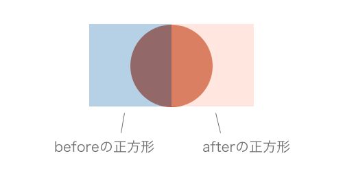
また、beforeで作った正方形と、afterで作った正方形の位置も重要になってくる。
先ほど作成した円の左半分に、beforeで作成した正方形の右半分を重ね、
円の右半分には、afterで作成した正方形の左半分を重ねた位置に配置する。
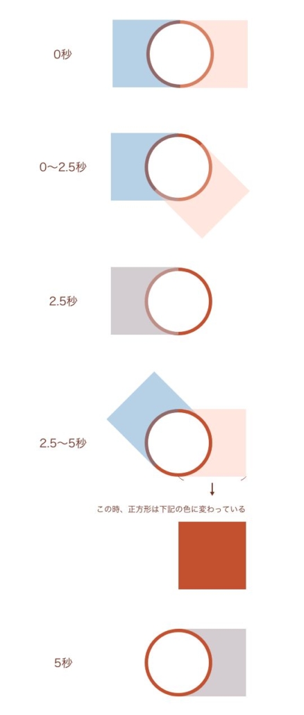
文章だとわかりにくいと思うので、下記の画像を参照してほしい。
あとはこの正方形を回転させて、プログレスバー風に見せるような動きを実装していくことになる。
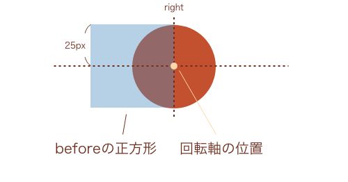
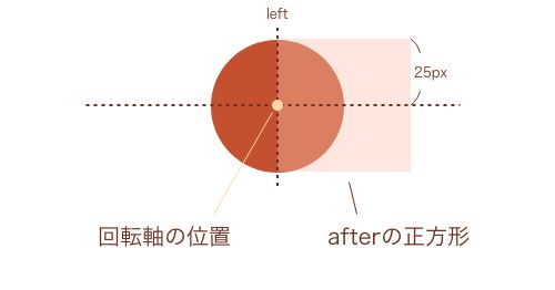
上記のソースで、transform-originの値を指定しているが、これは回転軸をどこにするか決めるために必要な記述になる。
この指定をすることで、x軸方向ならびにy軸方向の座標が決定できる。
初期値は50%、50%で回転軸が正方形の中心になっているので、この値を変更する必要がある。
leftは左端、rightは右端、topは上端、bottomは下端、任意の数値+pxは要素の左上を基準として位置を指定する。
今回だと、beforeにはright 25px、afterにはleft 25pxを指定している。画像にすると下記のイメージになる。
これで擬似要素は準備ができた。
プログレスバーの円を縁だけが表示されて見せるためにベースの円よりも一回り小さい円を作成
.circle .circle_inner {
    position: absolute;
    top: 50%;
    left: 50%;
    transform: translate(-50%, -50%);
    width: 45px;
    height: 45px;
    background: #fff;
    border-radius: 50%;
    z-index: 4;
    display: flex;
    align-items: center;
    justify-content: center;
    color: #c3512f;
}
こちらもそこまで難しくない。上下左右中央になるように直径が45pxの円を配置した。また、テキストを中に入れた時に、上下左右中央に配置されるようにも設定している。
これで、小さい円がベースの円の上並びに2つの正方形のレイヤーの上に重なったため、見た目がボーダーのような円ができる。
ちなみに、この円がいらない場合、円グラフの12時の針から割合がどんどん増えて1周していくような見た目になる。

スライダーがアクティブになっているときにanimationとkeyframesで擬似要素の正方形を回転させる
.swiper-slide-thumb-active .circle::before {
    animation: circleBefore 5s linear forwards;
}
.swiper-slide-thumb-active .circle::after {
    animation: circleAfter 5s linear forwards;
}
@keyframes circleAfter {
    0%   {
        transform: rotate(0deg);
        background: #ffc2b0;
    }
    50%  {
        transform: rotate(180deg);
        background: #ffc2b0;
    }
    50.01% {
        transform: rotate(360deg);
        background: #c3512f;
    }
    100% {
        transform: rotate(360deg);
        background: #c3512f;
    }
}
@keyframes circleBefore {
    0%   { transform: rotate(0deg); }
    50%  { transform: rotate(0deg); }
    100% { transform: rotate(180deg); }
}
animationやkeyframesの詳しい使い方は解説すると長くなるので省略させていただく。
swiper-slide-thumb-activeのclassは、スライダーがアクティブになっている状態の時に指定できるもので、swiperスライダーに元々つけられているclassだ。
このアクティブになっているときのbeforeとafterに対して、animationを使って回転させるようになっている。
beforeについて
5秒かけて(5s)、circleBefore(keyframesで指定した内容を)、アニメーション開始から終了まで一定に変化させ(linear)、アニメーションが終わった状態を維持させる(forwards)、という内容だ。
circleBeforeのkeyframesでは、0%〜50%までは回転しないように設定されているので、実際は2.5秒〜5秒の間で正方形が0度〜180度回転するアニメーションが発火される。
これが左半分のプログレスバーを実装する部分にあたる。
afterについて
5秒かけて(5s)、circleAfter(keyframesで指定した内容を)、アニメーション開始から終了まで一定に変化させ(linear)、アニメーションが終わった状態を維持させる(forwards)、という内容だ。
circleAfterのkeyframesでは、0%〜50%まではbackgroundが#c3512f の状態で0度〜180度回転するが、その直後〜100%は、background が#c3512fで360度の場所まで一気に回転するアニメーションが発火される。
なぜカラーを設定する必要があるのかというと、回転する順番を元に説明していければと思う。
1.右側のafterの正方形が0〜2.5秒かけて180度回転する。
- 右側のafterの正方形が回転した時、これまで正方形で隠れていたベースの円が見えた状態になる。これがプログレスバーの右半分(時計で例えると0時〜6時まで)にあたる。
- 右側のafterの正方形が回転した時、左半分の円に重なってしまう。このためにbackgroundでカラーを正方形と同じ色にしている(厳密には2.のステップでbackgroundが別の色になるので元に戻すという理由になる)。
2.左側のbeforeの正方形が2.5秒〜5秒かけて180度回転する。また同時に右側のafterの正方形が2.5秒直後〜5秒かけて一気に360度まで回転する。
- 左側のbeforeの正方形が回転した時、これまで正方形で隠れていたベースの円が見えた状態になる。これがプログレスバーの左半分(時計で例えると6時〜12時まで)にあたる。
- 左側のbeforeの正方形が回転した時、右半分の円に重なってしまうが、z-indexの重なり順の関係で影響は出ないようになっている。
- 右側のafterの正方形が2.5秒直後〜5秒かけて一気に360度まで回転したときは、backgroundのカラーをベースの円と同じ色にする必要がある。
テキストだと複雑なので、画像も作ってみた。下記のようなイメージになる。
これでCSSは実装完了となる。
JavaScriptの記述について
'use strict'
window.onload = function () {
  const swiper = new Swiper('.mySwiper', {
    spaceBetween: 10,
    slidesPerView: 4,
    watchSlidesProgress: true,
  })
  const swiper2 = new Swiper('.mySwiper2', {
    loop: true,
    speed: 300,
    effect: 'fade',
    navigation: {
      nextEl: '.swiper-button-next',
      prevEl: '.swiper-button-prev',
    },
    autoplay: {
      delay: 5000,
      disableOnInteraction: false,
    },
    thumbs: {
      swiper: swiper,
    },
    on: {
      slideChange: function () {
        if (this.realIndex > 0) {
          this.params.autoplay.delay = 4700
        }
      },
    },
  })
}
前回の記事と同じソース部分の解説は省略するので、読んでいない方は下記の記事を読んでから読み進めることをおすすめする。
ポイントはspeed: 300、delay: 5000の秒数と、下記のソース部分だ。
on: {
  slideChange: function () {
    if (this.realIndex > 0) {
      this.params.autoplay.delay = 4700
    }
  },
},
今回は、5秒経過(delay)したら、0.3秒(speed)かけてスライダーが切り替わるようにページを実装している。
ここでちょっと考えることが出てくる。一番初めにページを読み込んだときに、1枚目から2枚目にスライダーが切り替わる時間は何秒であるかということだ。
答えは、ページ読み込み時のspeedの0.3秒が計算されなくなるので、実際は5秒になる。
ここからまた、考えてほしい。今度は2枚目から3枚目にスライダーが切り替わるときは何秒になるだろうか。
先ほどの考えに当てはめると、speedの0.3秒が計算されることになるので、5.3秒になる。これは3枚目以降も同様の秒数で切り替わる。
ということは、ページを読み込んでからスライダーが1枚目から2枚目に切り替わる時間の5秒と、2枚目以降の切り替わる5.3秒には、0.3秒の差が生じていることがわかる。
この0.3秒という差を埋めるために、先程あげたソースを記述している。使い方は下記リンクでも紹介されている。
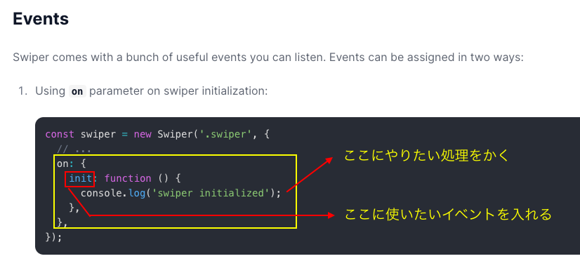


やっていることは、スライドが切り替わるときに(slideChange)、スライダーの2枚目以降(realIndex > 0)が4.7秒経過(delay)したら切り替わるという内容である。
このrealIndexがなぜ0という値になっているのかというと、JavaScriptでは初めの配列(インデックス)の番号が0から始まるようになっているので、初めのスライダー1枚目に対して、JavaScript側では0という番号に対応するようになっている。
このためrealIndex > 0とすることで、2枚目以降のスライドに対して指定することができるのだ。
以上で実装完了だ。
色々詰め込んではみたが、デメリットもあることだけはお伝えしておきたい。
例えばスライドの数があまりにも多くなった場合は、このやり方はおすすめできない。なぜかというと、毎回HTML側にサムネイル部分のソースを記述する手間が増えてしまうためだ。
また、JavaScript側でもサムネイルの数を調整したり、CSSでも数が多くなったときの調整が意外と大変になってくる。
用途に応じて使ってみることをおすすめする。
