ページネーションを円形のプログレスバーにしたSwiperスライダーを実装してみる(備忘録)
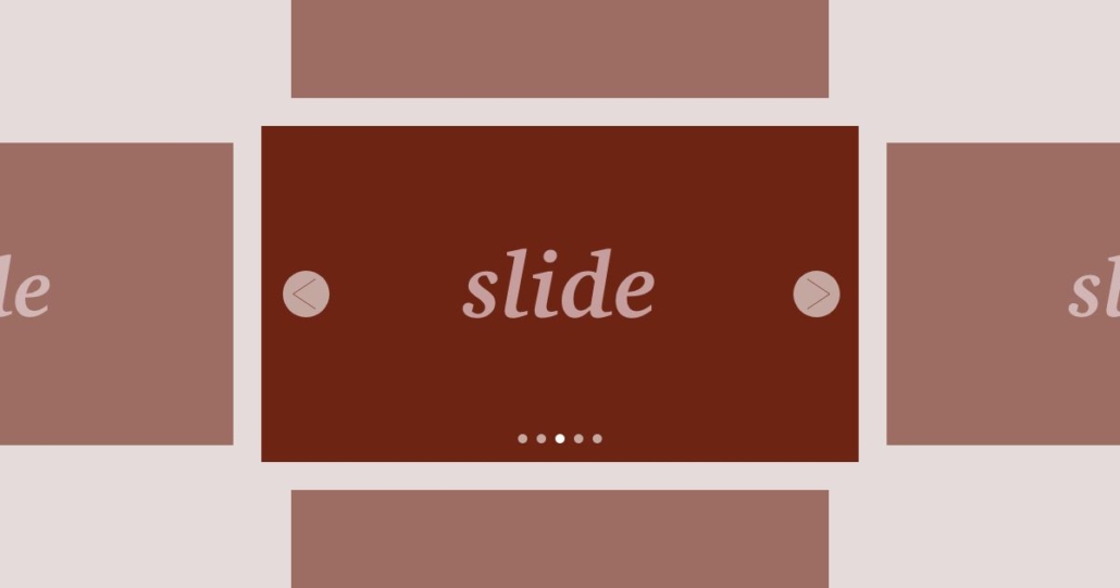
今回はページネーション(画像下の丸い部分)を円形のプログレスバーにしたSwiperスライダーを実装していく。
前回の記事(リンク)とはアプローチが異なり、単純にページネーション(画像下の丸い部分)を円形のプログレスバーに見た目を変更して対応する方法となっている。
なお、円形のプログレスバーの作成方法は全く同じである。
HTMLの記述について
<!DOCTYPE html>
<html lang="ja">
<head>
  <meta charset="UTF-8">
  <meta name="viewport" content="width=device-width, initial-scale=1.0">
  <title>Swiperスライダー</title>
  <link rel="stylesheet" href="../reset.css">
  <link rel="stylesheet" href="https://unpkg.com/swiper@8/swiper-bundle.min.css" />
  <link rel="stylesheet" href="style.css">
</head>
<body>
  <main>
    <div class="swiperCont">
      <div class="swiper mySwiper">
        <div class="swiper-wrapper">
          <div class="swiper-slide">
            <img src="img1.jpg" />
          </div>
          <div class="swiper-slide">
            <img src="img2.jpg" />
          </div>
          <div class="swiper-slide">
            <img src="img3.jpg" />
          </div>
          <div class="swiper-slide">
            <img src="img4.jpg" />
          </div>
        </div>
      </div>
      <div class="swiper-pagination"></div>
      <div class="swiper-button-prev"></div>
      <div class="swiper-button-next"></div>
    </div>
    <section>
      <div class="ly_inner" id="menu1">
        <h2>menu1</h2>
        <div class="md_textblock">
          <p>テキストが入りますテキストが入りますテキストが入りますテキストが入りますテキストが入りますテキストが入ります</p>
          <p>テキストが入りますテキストが入りますテキストが入りますテキストが入りますテキストが入りますテキストが入ります</p>
          <p>テキストが入りますテキストが入りますテキストが入りますテキストが入りますテキストが入りますテキストが入ります</p>
          <p>テキストが入りますテキストが入りますテキストが入りますテキストが入りますテキストが入りますテキストが入ります</p>
          <p>テキストが入りますテキストが入りますテキストが入りますテキストが入りますテキストが入りますテキストが入ります</p>
        </div>
      </div>
    </section>
    <section>
      <div class="ly_inner" id="menu2">
        <h2>menu2</h2>
        <div class="md_textblock">
          <p>テキストが入りますテキストが入りますテキストが入りますテキストが入りますテキストが入りますテキストが入ります</p>
          <p>テキストが入りますテキストが入りますテキストが入りますテキストが入りますテキストが入りますテキストが入ります</p>
          <p>テキストが入りますテキストが入りますテキストが入りますテキストが入りますテキストが入りますテキストが入ります</p>
          <p>テキストが入りますテキストが入りますテキストが入りますテキストが入りますテキストが入りますテキストが入ります</p>
          <p>テキストが入りますテキストが入りますテキストが入りますテキストが入りますテキストが入りますテキストが入ります</p>
        </div>
      </div>
    </section>
    <section>
      <div class="ly_inner" id="menu3">
        <h2>menu3</h2>
        <div class="md_textblock">
          <p>テキストが入りますテキストが入りますテキストが入りますテキストが入りますテキストが入りますテキストが入ります</p>
          <p>テキストが入りますテキストが入りますテキストが入りますテキストが入りますテキストが入りますテキストが入ります</p>
          <p>テキストが入りますテキストが入りますテキストが入りますテキストが入りますテキストが入りますテキストが入ります</p>
          <p>テキストが入りますテキストが入りますテキストが入りますテキストが入りますテキストが入りますテキストが入ります</p>
          <p>テキストが入りますテキストが入りますテキストが入りますテキストが入りますテキストが入りますテキストが入ります</p>
        </div>
      </div>
    </section>
    <section>
      <div class="ly_inner" id="menu4">
        <h2>menu4</h2>
        <div class="md_textblock">
          <p>テキストが入りますテキストが入りますテキストが入りますテキストが入りますテキストが入りますテキストが入ります</p>
          <p>テキストが入りますテキストが入りますテキストが入りますテキストが入りますテキストが入りますテキストが入ります</p>
          <p>テキストが入りますテキストが入りますテキストが入りますテキストが入りますテキストが入りますテキストが入ります</p>
          <p>テキストが入りますテキストが入りますテキストが入りますテキストが入りますテキストが入りますテキストが入ります</p>
          <p>テキストが入りますテキストが入りますテキストが入りますテキストが入りますテキストが入りますテキストが入ります</p>
        </div>
      </div>
    </section>
    <section>
      <div class="ly_inner" id="menu5">
        <h2>menu5</h2>
        <div class="md_textblock">
          <p>テキストが入りますテキストが入りますテキストが入りますテキストが入りますテキストが入りますテキストが入ります</p>
          <p>テキストが入りますテキストが入りますテキストが入りますテキストが入りますテキストが入りますテキストが入ります</p>
          <p>テキストが入りますテキストが入りますテキストが入りますテキストが入りますテキストが入りますテキストが入ります</p>
          <p>テキストが入りますテキストが入りますテキストが入りますテキストが入りますテキストが入りますテキストが入ります</p>
          <p>テキストが入りますテキストが入りますテキストが入りますテキストが入りますテキストが入りますテキストが入ります</p>
        </div>
      </div>
    </section>
  </main>
  <script src="https://unpkg.com/swiper@8/swiper-bundle.min.js"></script>
  <script src="style.js"></script>
</body>
</html>
ソース自体は、下記の記事と同じ内容になっている。
ちなみに、前回の記事では、HTMLに直接円形のプログレスバーを実装するためのソースを記述していたが、今回はJavaScript側で実装するので、HTML側では下記の記述だけでOKだ。
<div class="swiper-pagination"></div>CSSの記述について
@charset "utf-8";

/* ==========================
  初期設定
========================== */
*,
*::before,
*::after {
  box-sizing: border-box;
}
body {
  position: relative;
}
img {
  width: 100%;
}

/* ==========================
  swiperslider
========================== */
.swiperCont {
  /* width: 80%; */
  margin: 0 auto;
  position: relative;
}
.swiper {
  width: 100%;
}
.swiper-button-next,
.swiper-rtl .swiper-button-prev,
.swiper-button-prev,
.swiper-rtl .swiper-button-next {
  background-color: #ccc;
  border-radius: 50%;
  padding: 30px;
}
.swiper-button-next:focus,
.swiper-rtl .swiper-button-prev:focus,
.swiper-button-prev:focus,
.swiper-rtl .swiper-button-next:focus {
  outline: none;
}
.swiper-button-prev:after,
.swiper-rtl .swiper-button-next:after,
.swiper-button-next:after,
.swiper-rtl .swiper-button-prev:after {
  color: #fff;
  font-size: 24px;
}
.mySwiper {
  margin-top: 10px;
}
.mySwiper .swiper-slide {
  opacity: 0.4;
}
.mySwiper .swiper-slide-thumb-active {
  opacity: 1;
}
.swiper-horizontal > .swiper-pagination-bullets,
.swiper-pagination-bullets.swiper-pagination-horizontal,
.swiper-pagination-custom,
.swiper-pagination-fraction {
  bottom: -70px;
}
/* 円形のプログレスバー */
.circle {
    position: relative;
    width: 50px;
    height: 50px;
    background: #c3512f;
    border-radius: 50%;
    text-align: center;
    overflow: hidden;
    z-index: 1;
    margin: auto;
    cursor: pointer;
}
.circle::before {
    content: "";
    display: block;
    position: absolute;
    top: 0;
    left: -25px;
    width: 50px;
    height: 50px;
    background: #ffc2b0;
    transform-origin: right 25px;
    z-index: 2;
}
.circle::after {
    content: "";
    display: block;
    position: absolute;
    top: 0px;
    left: 25px;
    width: 50px;
    height: 50px;
    background: #ffc2b0;
    transform-origin: left 25px;
    z-index: 3;
}
.swiper-pagination-bullet.swiper-pagination-bullet-active.circle::before {
    animation: circleBefore 5s linear forwards;
}
.swiper-pagination-bullet.swiper-pagination-bullet-active.circle::after {
    animation: circleAfter 5s linear forwards;
}
.circle .circle_inner {
    position: absolute;
    top: 50%;
    left: 50%;
    transform: translate(-50%, -50%);
    width: 45px;
    height: 45px;
    background: #fff;
    border-radius: 50%;
    z-index: 4;
    display: flex;
    align-items: center;
    justify-content: center;
    color: #c3512f;
}
@keyframes circleAfter {
    0%   {
        transform: rotate(0deg);
        background: #ffc2b0;
    }
    50%  {
        transform: rotate(180deg);
        background: #ffc2b0;
    }
    50.01% {
        transform: rotate(360deg);
        background: #c3512f;
    }
    100% {
        transform: rotate(360deg);
        background: #c3512f;
    }
}
@keyframes circleBefore {
    0%   { transform: rotate(0deg); }
    50%  { transform: rotate(0deg); }
    100% { transform: rotate(180deg); }
}

/* ==========================
  コンテンツの中身
========================== */
.ly_inner {
  width: 100%;
  max-width: 1080px;
  margin: 100px auto;
  padding: 20px;
  background-color: #ccc;
}
.ly_inner h2 {
  font-size: 150%;
  font-weight: bold;
  margin-bottom: 30px;
}
.md_textblock > * + * {
  margin-top: 10px;
}


/* ====================================
  ここからPC幅
==================================== */
@media screen and (min-width: 768px) {
  .swiper-pagination-horizontal.swiper-pagination-bullets .swiper-pagination-bullet.circle {
    margin: 0 20px;
  }
}
こちらも既に過去の記事で解説している内容のため、詳しくは解説しない。下記の記事で詳しくは解説しているので、参考にしてほしい。
ページネーション(画像下の丸い部分)の間隔については、下記のようにして調整は可能だ。
.swiper-pagination-horizontal.swiper-pagination-bullets .swiper-pagination-bullet.circle {
  margin: 0 20px;
}
JavaScriptの記述について
'use strict'
window.onload = function () {
  const swiper = new Swiper('.mySwiper', {
    loop: true,
    speed: 300,
    effect: 'fade',
    pagination: {
      el: '.swiper-pagination',
      clickable: true,
      spaceBetween: 40,
      renderBullet: function (index, className) {
        return (
          '<div class="' +
          className +
          ' circle' +
          '"><div class="circle_inner">' +
          (Number(index) + 1) +
          '</div></div>'
        )
      },
    },
    navigation: {
      nextEl: '.swiper-button-next',
      prevEl: '.swiper-button-prev',
    },
    autoplay: {
      delay: 5000,
      disableOnInteraction: false,
    },
    on: {
      slideChange: function () {
        if (this.realIndex > 0) {
          this.params.autoplay.delay = 4700
        }
      },
    },
  })
}
こちらも既に過去の記事で紹介している部分の解説は省略させていただきたい。詳しくは下記からご覧いただければと思う。
ポイントは下記のrenderBulletの箇所である。
pagination: {
  renderBullet: function (index, className) {
    return (
      '<div class="' +
      className +
      ' circle' +
      '"><div class="circle_inner">' +
      (Number(index) + 1) +
      '</div></div>'
    )
  },
},
renderBulletについては、下記の公式ドキュメントにも記載がある。

renderBullet はpaginationの中で使用できるパラメーターで、indexの番号と、classの名前を付与することができる。
今回はpaginationの中で下記のHTMLを生成してくれるように対応している。
<div class="circle">
  <div class="circle_inner">1</div>
</div>
returnについて
returnは、関数の実行を終了して、呼び出し元に値が返されるため、この場合は括弧の中で記述されている内容が返されることになります。
stringとnumberを繋げる対応について
シングルクォーテーションを使っているのは文字(string)、使っていないのは数字(number)になるので、「+」を使って繋げている。
circleのclassについて
「 circle」の記述は先頭を半角スペース空けて対応している。これはcircleというclass名が割り当てられるようにするためである。
Number(index) + 1について
Number(index) のままだと、下記のように番号が1つズレてしまう。
- スライダーの1枚目 = 0【Number(index) の値】
- スライダーの2枚目 = 1【Number(index) の値】
- スライダーの3枚目 = 2【Number(index) の値】
- スライダーの4枚目 = 3【Number(index) の値】
なので、Number(index) + 1としてあげることで、下記のようにズレがなくなるというわけだ。
- スライダーの1枚目 = 1【Number(index) + 1の値】
- スライダーの2枚目 = 2【Number(index) + 1の値】
- スライダーの3枚目 = 3【Number(index) + 1の値】
- スライダーの4枚目 = 3【Number(index) + 1の値】
以上で実装完了だ。
こちらの方が、前回紹介した内容よりも実務向きかもしれない。
ただ、円形のプログレスバーについて言及しておくと、いろんなページを見ていると、SVGで対応していることが結構多いなと感じるので、興味のある方はそちらの方法でも試してみるといいかと思う。

トラックバック & ピングバック
[…] 前回の記事はこちら […]
コメントはクローズされています。