縦方向にスライドするシンプルなSwiperスライダーを実装してみる(備忘録)
今回は縦方向にスライドするシンプルなSwiperスライダーを実装していく。
実はページネーション(ドット部分)を除けば、CSSだけでも実装することはできる。scroll-snap-typeというプロパティがあるので興味のある方は調べてほしい。そのうち、本ブログでも紹介していく予定だ。
さて、本題に入っていくが、自分は縦方向にスライドはあまり好きではない。というのも、誤クリックや誤スクロールによって、今見ていたコンテンツから勝手に移動してしまったりといったことが多いこと、また自分が今どのページの位置にいるのかということが分かりにくいと感じるからだ。
ただ分かりにくくても実装する場面はあるので、使い方は覚えておいた方が対応できる幅が広がるのでいいかと思う。
それでは実装に入っていく。
HTMLの記述について
<!DOCTYPE html>
<html lang="ja">
<head>
<meta charset="UTF-8">
<meta name="viewport" content="width=device-width, initial-scale=1.0">
<title>Swiperスライダー</title>
<link rel="stylesheet" href="../reset.css">
<link rel="stylesheet" href="https://unpkg.com/swiper@8/swiper-bundle.min.css" />
<link rel="stylesheet" href="style.css">
</head>
<body>
<main>
<div class="swiper-container">
<div class="swiper-wrapper">
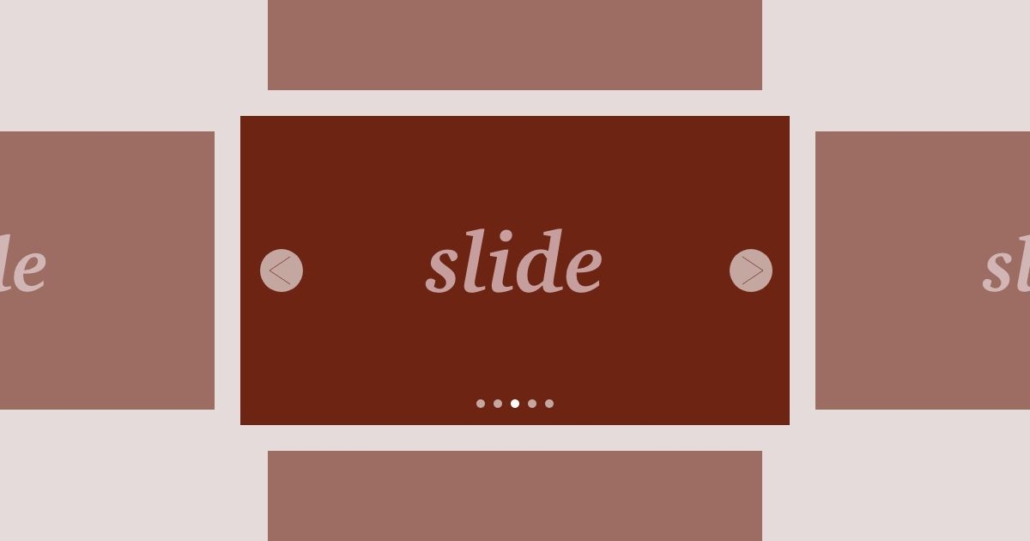
<div class="swiper-slide">slider1</div>
<div class="swiper-slide">slider2</div>
<div class="swiper-slide">slider3</div>
</div>
<div class="swiper-pagination"></div>
</div>
</main>
<script src="https://ajax.googleapis.com/ajax/libs/jquery/3.1.1/jquery.min.js"></script>
<script src="https://unpkg.com/swiper@8/swiper-bundle.min.js"></script>
<script src="style.js"></script>
</body>
</html>HTMLはシンプルなので、解説は省略する。これまで書いてきた記事を見ていただくと理解できると思う。
CSSの記述について
@charset "utf-8";

/* ==========================
  初期設定
========================== */
*,
*::before,
*::after {
  box-sizing: border-box;
}

body {
  position: relative;
  word-wrap: break-word;
}

img {
  width: 100%;
}

/* ==========================
  swiperslider
========================== */
.swiper-container {
  width: 100%;
  height: 100vh;
  overflow-y: hidden;
}
.swiper-slide {
  height: 100%;
  width: 100%;
  display: flex;
  justify-content: center;
  align-items: center;
  font-size: 24px;
  font-weight: bold;
  color: #fff;
}

.swiper-slide:nth-of-type(1) {
  background-color: #edda15;
}
.swiper-slide:nth-of-type(2) {
  background-color: #73a82d;
}
.swiper-slide:nth-of-type(3) {
  background-color: #2a6d39;
}

@media screen and (min-width: 768px) {
  .swiper-slide {
    font-size: 60px;
  }
}
ポイントは下記だ。heightを100%ではなく100vhにしていること、また、スクロールバーが表示されないようoverflow-yをhiddenに設定している点だ。これによって、画面いっぱいに1つのスライダーの中身が表示されるようになる。
.swiper-container {
  width: 100%;
  height: 100vh;
  overflow-y: hidden;
}
あとはスライダーの中身のテキストが、上下左右中央の位置になるよう調整しているだけである。
.swiper-slide {
  height: 100%;
  width: 100%;
  display: flex;
  justify-content: center;
  align-items: center;
  font-size: 24px;
  font-weight: bold;
  color: #fff;
}
JavaScriptの記述について
'use strict'

// swiperslider
const swiper = new Swiper('.swiper-container', {
  direction: 'vertical',
  slidesPerView: 1,
  speed: 500,
  grabCursor: true,
  mousewheel: true,
  pagination: {
    el: '.swiper-pagination',
    type: 'bullets',
    clickable: true,
  },
})
ポイントは、directionをverticalに設定することだ。これによりスライダーが縦方向になる。
その他の部分は、過去にも記事にしているので省略する。大まかに説明すると、スピード、マウスを置いたときに掌マークに、マウスでスクロールしてスライダーが動かせるように、ページネーションのタイプやクリック有効化の設定をしているだけだ。
以上で実装完了だ。
